Last month, we hosted a webinar about ensuring a reliable digital eCommerce experience for the holiday season. This blog post will expand upon what we talked about in the webinar. In case you missed it, the webinar is available on-demand.
In this blog, we’ll talk about:
- Challenges of frontend testing eCommerce apps
- Methods for frontend testing
- Shopper personas and how to test for them
- How Applitools helps test eCommerce apps
Challenges of frontend testing eCommerce apps
Traditional testing methods don’t always test your eCommerce applications in the same way that your customers shop. Properly capturing user scenarios based on how customers behave in your app is challenging, and writing stable tests that properly test these scenarios scale is tedious and can slow releases.

Data-rich testing scenarios
There’s a lot of data involved in eCommerce apps – product data, user data, app state, and so many different combinations of this data for different users as they shop in your virtual store. All of this data creates a lot of different potential user paths and testing scenarios to cover the different combinations of states based on product information and buyer information.

Multi-screen browsing
Shoppers may be on different browsers, on desktop or different mobile devices, or even using them in tandem to find the product they want – finding the product on their mobile device but completing the purchase on their laptop. A truly omnichannel experience requires that your app looks good and works on every combination of these screen sizes and operating systems.

A/B experimentation
Experimenting with the look and feel of your app can increase conversions and purchase. This puts a lot of pressure on QA to ensure the A/B experiments are properly tested, but these experiments often have complex logic on their own. And to test these A/B experiments, the test will have to mimic the complex experiment logic and understand the context of the situation. Your product team is doing the work of a permanent test case for an experiment that may be fleeting and not in production for long if it fails.

Localization
There are a lot of global markets and vendors that sell online in many different countries across many different languages. Testing the languages supported is not only a requirement but also a challenge. Building the test cases and resourcing the right people who can test the implemented languages in context takes a lot of time and specific skill sets. To multiply the challenge, each time we add a language, we need to create and maintain new tests across browsers.

Post-production content
Your product or marketing teams may be updating or adding content that enters the app outside of the development process through a CMS, or analysts may be entering information about a new product into an ERP system. Something like adding a new headline or a new percentage to a product may truncate on a smaller screen, going from one line to two lines, which affect spacing elsewhere on the screen or even overlap onto other elements. You’ll need to create a set of tests that are able to be flexibly kicked off and monitored across small aspects of the content that may change without triggering a CI/CD build when changed.

Customer-generated content
Customer-generated content like reviews and product photos are not going to be in your development pipeline. With post-production content, you may have a style guide or requirements for copy and images, but customers aren’t adhering to a style guide. Ensuring that the content appears correctly within your templates for this content is important, and setting character limits and image resolution requirements can keep this content more consistent.
Methods for frontend testing
The traditional way to test frontend functionality includes hundreds of assertions of what the app should do in what we deem are the most important aspects of the experience – like product labels, buy-now buttons, or add-to-cart buttons. Even just testing the priority aspects of your app with these assertions creates technical debt, as things change and tests need to be maintained.
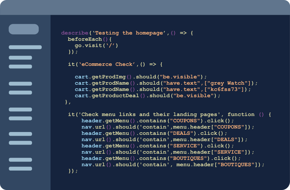
Common methods for frontend testing
We are big believers in doing testing in a layered approach to provide proper coverage of your app. No one way of testing can cover everything. Here are some common methods to include in frontend testing your eCommerce app or website.
Component testing
Component testing is essentially atomic unit tests on components of your frontend. Due to the repeated nature of eCommerce apps – with elements being used across product pages and category pages – testing components of a design system can save a lot of time over checking assertions for individual elements. These components still lack context of the entire application, which leaves room for errors to occur when these components are together in production.
Smoke testing
There’s a lot you can do from a validation standpoint for the web both locally and in test environments to continually make sure that all of your products are showing up. Smoke testing consists of fast tests that validate that the app is able to run without failure, missing bugs that aren’t mission critical. This can include simple crawling of URLs to make sure that they don’t return an error or that uniquely created query parameters are getting created as expected. These tests are the fastest way to get quick uptime coverage for multi-page application e-commerce sites.
End-to-end testing
A common final approach in testing is end-to-end testing around specific scenarios, but even those have challenges. You have to experience end-to-end scenarios to understand them, which means that you’re only able to test for what you know. There may be common bugs that come up in customer tickets or problem areas that you see a lot in QA tickets during your sprints. We can only run so many scenario tests, so you need to take time to establish testing priorities.
Test prioritization
When it comes to prioritizing what to test, it can help to follow the Pareto principle, where 80% of the consequences come from 20% of the causes. This means that you want to test the most impactful aspects of your eCommerce experience to cover the most impact. By this principle, around 20% of your templates are going to drive 80% of your actual revenue, so it’s really important to prioritize the most important 20% of your app or website.
For eCommerce, the most important parts of the app revolve around things like the:
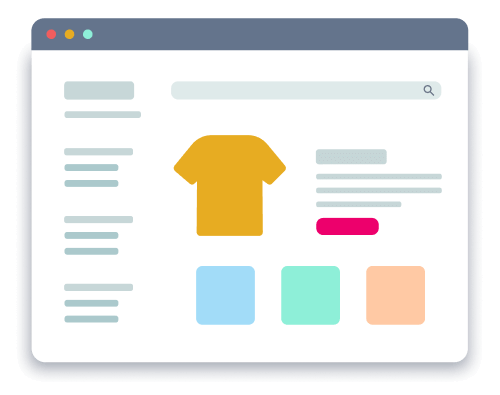
- Home page: Unless your customer followed a direct link through social or paid media, the home page is likely the landing page for most of your customers. The home page is where you’ll get much of your traffic, so your homepage needs to be on brand and working properly.
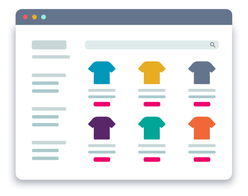
- Category pages: Category pages are a chance for you to help guide your customers to what they want. These pages often build off templates for navigational consistency for users, so layout testing is an important part of covering these pages.
- Individual pages: Individual product pages are the most numerous, but when you’re using a design system with components, they’re going to be very common in nature. Like category pages, they are often built from templates and layout testing is key.
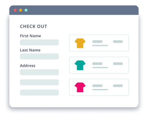
- Shopping cart: Your users may be browsing your site as they shop, so you need to test that cart data is maintained as a customer traverses the site. Your checkout system is where your users finalize their purchase, so if something goes wrong with it, you lose a sale.
- Search and filtering: A lot of customers will browse items by key words or filter by specific attributes, so making sure that your product metadata is tested can ensure the products show up in these results.
You start to see that you’re testing a lot of the same things. You just need to make sure that you can either use data-driven testing to make sure you’re getting the most scenarios or cross-browser testing of the most important parts across all the experiences that an end user is getting. Visual testing can kind of combine all those aspects – templated pages, localization, cross-browser testing – all at the same time in a much faster way.
A framework for ensuring proper test coverage
With eCommerce being more accessible than ever, more people are shopping online, which brings in different kinds of user behavior. We’ve put together a few different shopper personas that cover some of this user behavior. These personas help us research and design test cases that better match how customers interact with an eCommerce app.
The Peruser
These shoppers browse items and pages before purchasing. You can potentially see this trend of users through the pages per visit. These shoppers use categories and filters to find items. They may have multiple tabs of their browser open to different pages of your site or web app.
How do you test for them?
- Ensure metadata is connected: Filtering and categorization of products depends heavily on metadata. If any product listing is missing a tag or has an incorrect tag, it won’t show up for a customer and you may miss out on a sale.
- Test your app in multiple states of filtering and search: Filter menus, drop-downs, and autocomplete in search bars can change the way that application looks. You need to make sure that web elements appear where they should as UI states change.
- Use longer, end-to-end scenarios: Make sure that data carries over correctly between pages and user interactions. Test every page of your app in every UI state you can to emulate how your customer may go through your site.
The Social Buyer
These shoppers are brought in from social ads, paid media, or nurture emails. You can potentially see this trend of users who come in with referral cookies or through tracked links. These shoppers interact with paid ads in your app, and they find other products on your site through internal ads. They give product ratings and write reviews for other shoppers.
How do you test for them?
- Test experiences like pop-ups upon landing: Some parts of your app or site may only be shown to first-time visitors or users who have been on the site for a certain amount of time. The timing and presentation of these pop-ups needs to
- Test with referral cookies: Monitoring customer interactions through referral cookies gives you insights into user behavior and tracks where your app is getting its traffic from. Testing that these cookies are properly tracked ensures you’re getting accurate insights.
- Use multiple mobile screens: Visual elements may have different sizes or locations on a different screen size. Test your app or site across multiple breakpoints to accommodate any device your customers may be using to shop.
The Slow Poke
These shoppers take their time making their decision. They may take days between first viewing a product and purchasing, revisiting the site or app. This revisiting may even be on different devices and browsers to view the site when they visit the site or app.
How do you test for them?
- Test your app across different browsers and devices: Elements can behave or render differently in different browsers or operating systems. Test your app in different browsers and on different emulated or real devices to ensure your app works and looks right.
- Test shopping cart functionality based on cookies: Make sure your shopping cart maintains the correct products and information while the user continues shopping. If a user comes back a few days later to finalize their order, not having a functioning cart could lose you sales.
A faster way to test: Visual testing
Visual testing captures screenshots of your app at various stages and compares them to known baselines to catch unexpected visual changes. Adding this approach to your testing pipeline speeds up your frontend testing by giving you a way to test entire screens at a time, instead of individual components with individual assertions.
While visual testing allows us to cover aspects of functional testing with less code, using visual AI will unlock even more test automation capabilities like:
- Cross-browser testing
- Account balances
- Mobile device status bars
- News content
- Ad content
- User-submitted content
- Suggested content
- Notification icons
- Content shifts
- Mouse hovers
- Cursors
- Anti-aliasing settings
- Browser upgrades
To learn more about visual testing, read our Enhance your testing strategy with visual testing two-pager. Now that we’ve covered different methods of testing frontends, we’ll go into a few different types of users to keep in mind when testing your eCommerce app or website.
How Applitools helps test eCommerce apps
Applitools is a test automation platform that uses AI to help teams ship flawless digital experiences without the hassle of the traditional testing practices.
With Applitools Eyes and our next-gen testing cloud, Ultrafast Grid, developers and QA engineers can run tests to quickly validate frontend functionality, accessibility, and visual correctness with unprecedented speed and accuracy.
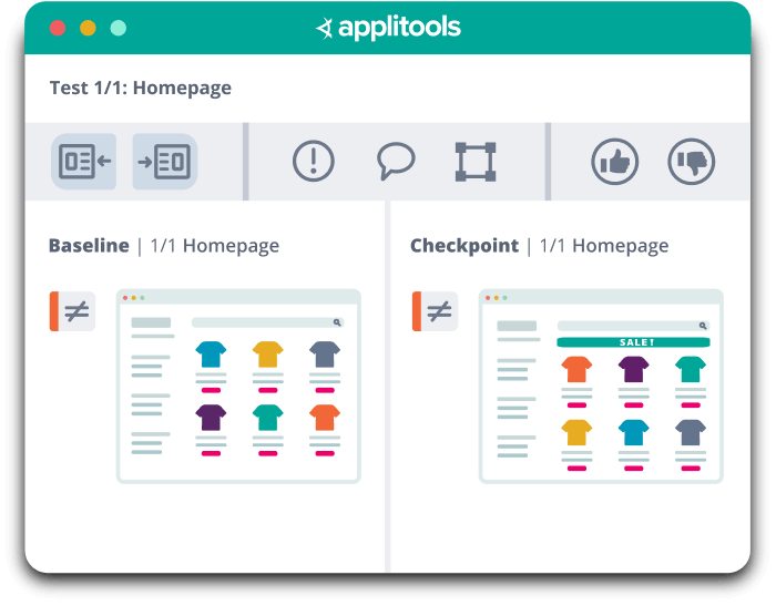
Applitools enables you to test for dynamic content, but also unlock a variety of AI-powered visual testing capabilities:
- Visual regression testing: As your digital storefront changes, Applitools Eyes captures screenshots across browsers and devices and compares them to a previously accepted baseline image of your app. Visual AI in Eyes enables you to test layouts and dynamic content, ignore colors, and ignore specific regions of pages or test specifics with customizable match levels.
- Cross-browser testing: Applitools AI-powered automated visual testing can test visual elements across OS, browser, orientation, and resolution combinations. Just running the first baseline rendering and functional test on a single combination is sufficient to test results across the range of potential platforms.
- Automated analysis: Teams can save time with auto-grouping when testing across different browsers, devices, or screen sizes. Auto-grouping will show something like a missing navigation item as one singular bug.
- Automated maintenance: Auto-maintenance automates the creation of new baselines or failure status across the same groupings created by our auto-grouping feature. Auto-maintenance also enables users to set granular controls over what gets updated automatically between checkpoints, test runs, and more.
- Root cause analysis: When unexpected changes do occur on your site, root cause analysis helps teams pinpoint exactly what changed in the DOM. It surfaces the exact difference in DOM elements based on visual changes – eliminating back and forth hunting down bugs.
- Multi-baseline testing: Applitools Eyes supports visual testing of applications that are undergoing A/B testing by allowing checkpoints to be matched against a baseline that includes multiple variations of the baseline image per checkpoint.
- Accessibility testing: Applitools Contrast Advisor seamlessly integrates into your Applitools Eyes test automation workflow to let you instantly see how well your application complies with WCAG color contrast guidelines – you don’t even need to re-run existing tests.
The live demo in the webinar covered visual regression testing, accessibility testing, and multi-baseline testing. To check out the live demo of using Applitools Eyes to test an eCommerce site, you can view the on-demand webinar. If you’re ready to try it yourself, you can create a free account or reach out to our sales team. Happy testing!

