Testers get a hard time sometimes: as soon as something is put in front of us, we tend to find problems with it. A skill some value, others not so much. However, we aren’t the only people blessed with this ability, hello designers!
Those problems get fixed, you test a bit more, and declare yourself done. You then sit down with the designer to review the implementation, and immediately: “Wrong! Wrong, that’s wrong”. “That’s the wrong font”. “Ahhh, that’s not the right blue”. “That margin is too small”.
I’m sure you’ve heard similar things. So why didn’t we find these issues? Of course there are infinite reasons, but I want to explore a common one: Inattentional Blindness.
Simply put: we don’t always see everything that is directly in front of us.
We blind ourselves based on lots of factors, In my opinion, one of the most common in testing is being what we’re actually testing for, i.e. where’s our focus. Some testers simply don’t know, they would just claim to be testing. Others would make claims to be testing functionality, other perhaps visually, or many of the others things to chose from. Either or, we will always struggle to spot all the issues.
Designers spend a large percentage of their time, well, designing. They’re emerged in the tool of their choice, analyzing mock ups and doodling on white boards. Tweaking here, tweaking there. A few pixels to the right, a few pixels to the left. A darker colour here, a lighter colour there. They dream about designs, just like some testers dream about the application as a whole… (or is it just me then?). When they finally look at the finished product, they are armed with so much more tacit knowledge than us, so they immediately start targeting areas that perhaps they had more discussion around, or simply areas that were concerning them the most.
Now I’m not saying that we can’t find the same issues that designers find, of course we could, but we would need some of that tacit knowledge that the designers have. We could build up this knowledge for ourselves, by talking to the designers, asking them questions about the design, for example; What was tricky to design? Which areas have more changes than others? And then use this to structure some testing solely focused on the visuals, taking advantage of available tools.
However, my preferred choice is to work alongside the designers, to ensure we get the best of all the minds. Test as a pair. Time doesn’t always allow such activities to take place, so on a previous project I decided to take advantage of some tools.
We had some basic UI checks in place for the majority of screens on our application, and would tend to create checks for new screens as they were created. I decided to incorporate a screenshot into this process. The check would take a screenshot after several key steps, and save it out to a shared drive. We would then collate those screenshots and review them as a pair. This approach saved us a lot of time, as we didn’t have to recreate the scenarios in real time to do the visual review. This worked well, but we started to wonder if this could be improved.
Time was the shortcomings of this approach: finding a time where we could both be present was sometimes difficult, therefore we would fallback to a direct comparison to the previous version, then I would send any noticeable changes to the designer for her to review. Reducing her workload from all of them, to the ones I believe required her attention. This was far from ideal, as it falls back to the previous problem: it relied on me to spot things, something I’d gotten better at due to all the pairing, but I still didn’t have that designer’s eye.
I started to think that there must be some tools out there that could automatically compare these images for me. I was very much aware of diff tools, so I looked for one with a specific focus on images, this lead me to ImageMagick.
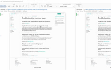
I integrated ImageMagick into the process, and I would run the comparison tool on the two images, which in turn would return me a mathematical percentage on the difference of the two images.
This improved the process, as it would draw my attention to the differences, however, I started to get a lot of false negatives, as the comparison it produced was pixel-perfect. So when the tool reports a 0.5% difference, I still have to investigate, as that 0.5% could potentially have been a serious issue, for example: a problem with the company’s logo.
However, in the majority of the time, it was a different I couldn’t even spot, even though the tool was reporting a difference, and sometimes, issues that even the designer couldn’t even spot!
However, our process was vastly improved with the addition of tools. Simply adding the screenshots and diff tool into our process did speed our goal up. Sure it wasn’t perfect, but it overcome the skill gap between myself and the designer when it comes to spotting visual issues.
It also reduced the time we had to spend on this activity, only getting together to look closer at some screens when the tool reported changes. Should point out that for new screens we still paired a lot in the first few iterations, as there was no baseline image for us to compare against.
Nowadays? Well as you could probably guess with me writing on this blog, I do visual checking on my products, and my current context is actually mobile. I still do the same process, however, I take advantage of the many tools available now to help us tackle this problem. Those tools do the screenshotting, comparing and result reporting seamlessly for us. Beyond seamlessly though, in most cases, it’s only a few lines of code to get up and running.
So, if are you experiencing a similar problem with your visual testing, and looking at implementing visual checking to keep on top of it, take a look at the tools in this post, give them a go.
I can tell you that implementing automated visual checking tools has vastly improved our approach to testing, and more importantly: it’s dedicated to checking the visual layer, which is what my designers actually care about, among other things, of course.
To read more about Applitools’ visual UI testing and Application Visual Management (AVM) solutions, check out the resources section on the Applitools website. To get started with Applitools, request a demo or sign up for a free Applitools account.
Author: Richard Bradshaw. You can read more about Richard’s view on automation on his blog. He is also an active tweeter, where you can find him as @FriendlyTester


