When I first succumbed to peer pressure from a few colleagues in the community to check out some of the new automated visual checking tools available, I was very skeptical. I’d been bitten by the visual checking promises in the past, the tools let the idea down back then.
The main tool suggested this time promised much, with the main advertisement message being that visual checking checks more than conventional GUI checks, which in turn would find more bugs. Certainly draws your attention, along the lines of more bang for your buck, immediately makes you think, this is a good thing!
This is a good thing, a great thing, even more so when all that additional checking comes with less code, less asserts and subsequently less maintenance.
Let me explain:
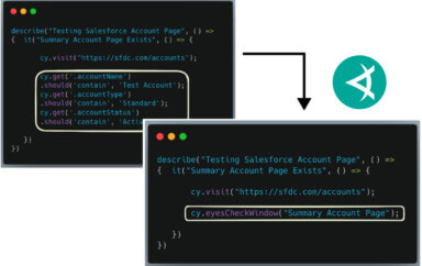
Most GUI checks tend to focus on specific results of the application. For instance, if it was submitting a form, a check would be made for a confirmation message on the screen. As in my last post, if validation failed, we would check for an error message being displayed. I believe this applies for the majority of GUI checks. Meaning that the rest of the page, for that specific check, goes unchecked. The rest of the page could be a complete mess, but as long as that confirmation is present and correct, green all the way. However, in order to do all those individual checks, we have to add methods to our Page Objects, we have to store strings to compare text against, we have to maintain many more assertions.
So what the advertising is telling us is that you could check that specific condition, and the rest of the page, in a single check. One check, that checks all the things.
Pretty impressive.
It is, it genuinely is.
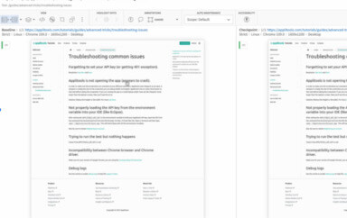
That is what these new tools are offering you, you can take a screenshot of the whole page, compare it to a baseline and have it report the differences to you. It’s also accurate enough to check the text, colours and also the layout, so you are indeed able to check more. Far beyond just the text in the scenario above.
So for the scenario above, we could have a check that’s focus is to check that the form confirmation page shows the correct message to the user. However, as we are using a visual checking tool we will also be checking the content of the entire page. So if the confirmation text was correctly displayed, but the text underneath that informing the user of what to do next wasn’t, but wasn’t just incorrect, it’s formatting was also completely wrong, these tools would detect this and inform you.
So it is the case, the statement is true. Adopting an automated visual checking tool over a more traditional approach would mean that you are checking more, therefore increasing the possibility of finding more information, and potentially, more bugs.
But…
My thoughts behind this post started by thinking about Continuous Integration (CI), thinking that if I’m now checking more, but more importantly things that I wouldn’t have explicitly checked, isn’t my build going to fail with things we don’t deem a problem.
Of course, there is a high probability that will happen, but in turn, there’s also a high probability that such a tool will detect something you wouldn’t have ever explicitly checked, but turns out to be a really important problem.
This is where Eyes stands out, as being a well designed tool. Some tools try to do many things, and a lot end up doing those things badly. Some tools try and succeed, but few in my experience. Applitools have focused the majority of their early development on the image comparison, this is the core of their product.
They can detect pixel perfection, however they have worked hard to build in tolerance to the image comparison engine, so that changes detected are visible to the human eye. Resulting in a very robust image comparison offering, giving the user multiple options. Then they have gone on to think deeply about how people want to use image comparison. Which is why, within the Eyes dashboard, you can choose to ignore parts of screenshots, therefore not including those areas in the comparison.
An example of this happened to me, whilst using Eyes with Appium. I was checking a page in our app, ran the script, went into Eyes, approved the screenshot and proceeded to run it again. To my disappointment, the script failed! Upon comparing the images, it was down to the time on the phone changing, which of course is included on a mobile screenshot. But I was able to draw a rectangle around the time on the screenshot and instruct Eyes to ignore that part of the image going forward.
So to summarise, whilst it may be true that automated visual checking tools may detect more changes, and potentially some of those changes you would have never thought to check, it’s also true that it may detect changes that you don’t deem a problem. However, Applitools have catered for this, allowing you to control what parts of an image are checked.
So as with any tool, it’s down to the human to decide how best to implement a tool. It’s down to the human to apply critical thinking, to determine a good strategy. It’s important to try, then change and repeat.
My advice would be to check the full page to start with, as I believe there is a lot of valuable information to be gained in doing so. Then monitor the strategy over time and tweak it accordingly, taking complete advantage of the flexibility provided by some of these automated visual checking tools such as Eyes.
***Click here to read Richard’s previous post “Automated Form Validation Checking”***
To read more about Applitools’ visual UI testing and Application Visual Management (AVM) solutions, check out the resources section on the Applitools website. To get started with Applitools, request a demo or sign up for a free Applitools account.
Author: Richard Bradshaw. You can read more about Richard’s view on automation on his blog. He is also an active tweeter, where you can find him as @FriendlyTester.


