This is a story about how standard tests were not able to identify a bug, as the CSS and HTML files were valid, but when rendered on Chrome on a Mac images were not displayed correctly. Applitools Ultrafast Grid (UFG) helped us identify the bug at an early stage in development, before deploying the change. These types of bugs are a regular occurrence in any organization, and without UFG, these bugs can easily make it to production and remain there undetected until a customer complains about the problem. Translation support from Michael Sedley.
Front end development is complicated, and it involves a wide range of knowledge and tools to develop web applications. Regression testing across different systems, browsers, and devices makes it almost impossible to be sure that an application will display correctly on every system and there are no visual regressions as a result of a minor code change.
A real-life example occurred to me during my first week as an Applitools employee, when I fixed a minor bug using my Linux machine. Inadvertently, in the process, I created a more serious visual bug which was only visible on certain devices.
Had UFG not alerted me to the bug, the code would have gone to production and the result would have affected the usability of our flagship product on a Mac. This would have reflected badly on the professionalism of the company and would have affected the company representation, trust in our product, and sales.
Understanding the problem
In recent months, we improved Applitools Eyes’ ability to perform visual testing on images which are semi-transparent. In the past, Eyes would test an entire screen or defined region, but now using the Storybook SDK, users can automatically test each component separately, without needing to define a test for each component.
For example, when testing a gallery component, Eyes can identify visual bugs and regressions over all screen elements, including the appearance of buttons, controls, fonts, shadows, images, as well as backgrounds that include a transparency gradient.

Figure 1: Transparent Background
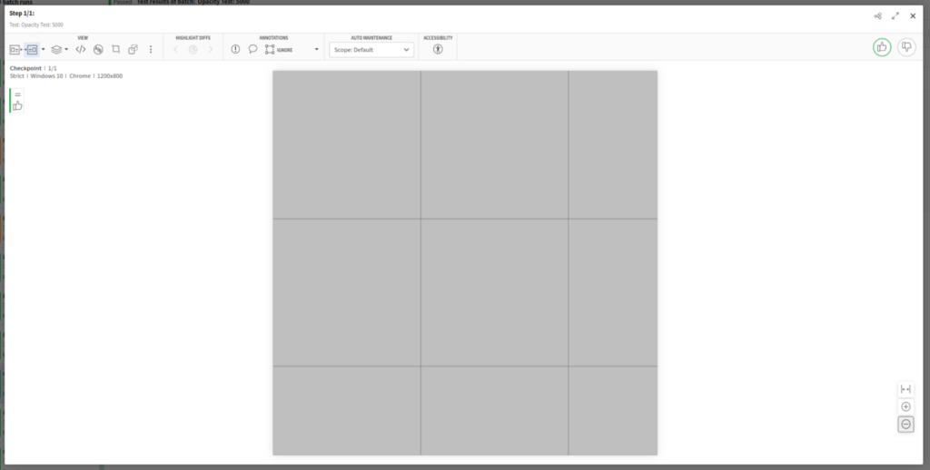
After implementing the transparency feature, a visual bug was reported. In a screen capture of a semi-transparent screen region, unexpected grid lines appeared on top of the tested image.
The root cause of these lines wasn’t clear, so as a first step, we developed a test plan to reproduce the issue. I created a semi-transparent image, all gray (rgb = 127,127,127), with a constant alpha (transparency) channel (alpha=0.5). Fortunately, the bug was easily reproduced and I managed to create easily identifiable grid lines:

As I experimented with different transparency settings, it was clear that the color of the grid lines was the same as the color of the image, and it became stronger as the image transparency was lower.
After further investigation, I discovered that the image viewer component uses tiles to represent large images, and the tiles had one pixel overlap. In the past, when all images were RBG images with no transparency, the overlapping pixel was not visible to the human eye. When I added semi-transparency, as the adjacent tiles were stacked on top of each other, sampling the outcoming color inside the grid line produced a 192 grayscale value, which is the exact outcome of stacking two half transparent gray layers over a white background:
(white ⋅ 0.5 + gray ⋅ 0.5) ⋅ 0.5 + gray ⋅ 0.5
given (white:=255, gray:=128)
Solving the preliminary bug
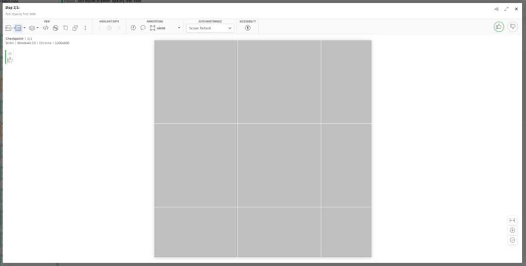
To resolve this bug, I recalculated the position and scale of each region so that there would not be an overlap and the line between regions would not appear.
For example, if the first tile had width: 480px and left: 0, the next adjacent tile should be positioned using left: 480, so that there is a zero pixel overlap between tiles.

I tested the results on my local (Linux) machine and assumed that the issue was resolved.
I didn’t realize that when I fixed this bug, I had also created a new issue which would have been almost impossible to anticipate.
How UFG identified the bug I created before deployment
At Applitools, we understand the importance of quality visual testing across browsers, so before deployment, every code change that impacts the Eyes interface must be tested by Applitools Eyes using UFG.
We are proud to “eat our own dogfood.” We rely on our visual testing tools to make sure that our products are visually perfect before release.
Our integration pipeline is configured to use UFG to test the UI change on multiple devices and screen settings so that we can confirm that the interface is consistent on every browser, operating system, and screen size.
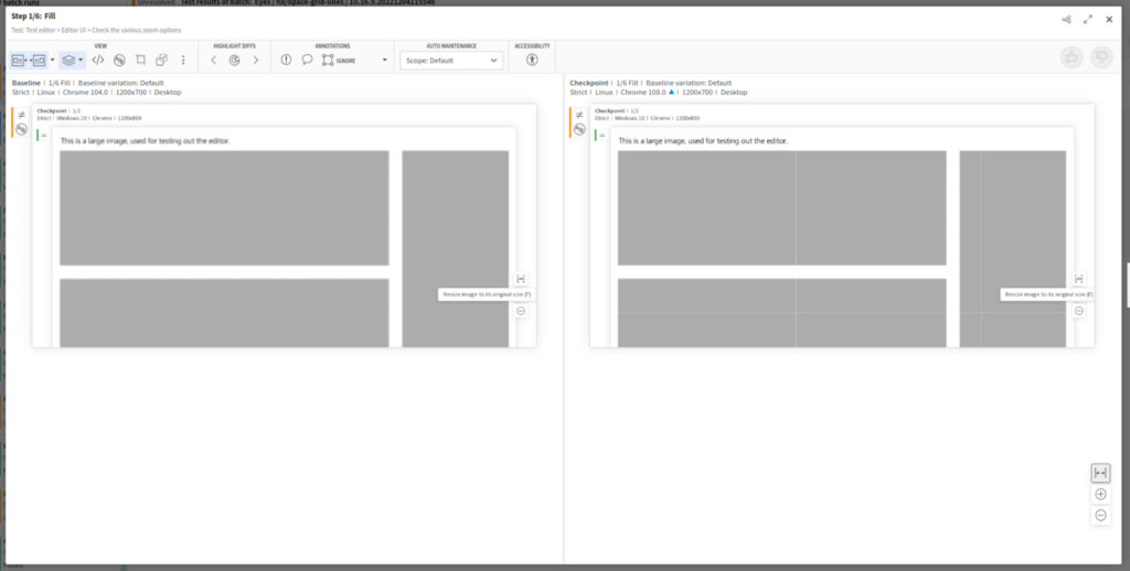
We discovered that fixing the bug of a one pixel overlap created a new bug on certain systems where there was a gap visible between tiles. Frustratingly, this bug was not reproducible in any of the devices used in development, and could not have been discovered with conventional manual visual testing.
The bug was only visible on screens with Retina Display which uses HiDPI.


What was interesting about this bug, is that it highlighted an inconsistency in the way that the same browser (Chrome) displays the same UI on different screen types.
What happened?
The bug and the solution
After some research, it turns out that there is (seemingly) a bug in the way Chrome behaves on Mac computers with Retina display (see 1, 2, 3). It turns out that using percentages or fractions of pixels for positioning and scaling of elements can lead to unexpected results.
So, what is the solution?
The solution itself is very elegant – all we had to do was to round each canvas scaling so that the canvas size would always be an integer:
scale = Math.round(scale * canvasSize) / canvasSize;
Thus, if the width of the canvas is 480 and our scale factor is 0.17, the width of our scaled canvas would not be 480 * 0.17 = 81.6, but would be 82 – this way we maintain compatibility with Retina displays and prevent unwanted gaps from being created.
This bug was easy to resolve once we were aware of it, but without UFG we would never have identified it using any of our test computers.
Conclusion
Maintaining a quality front end for all configurations is an ongoing challenge in every company and every organization.
Solving a bug for one audience can create a bigger bug for a wider audience. In this article, we saw a classic example of a malfunction, where the initial solution we implemented only made things worse.
The number of users who use Applitools Eyes for testing semi-transparent components is significantly lower than the number of eyes users who work with Retina displays (most Apple users) – so the initial approach we took to solve the problem could have caused significantly more harm than good. Even worse – we could have caused significant damage to the user experience, and not know about it. No modern organization wants to rely on frustrated customer feedback to discover bugs in their application or websites.
Using UFG reduces the likelihood that errors of this type will pass under the radar and allows developers, product managers, and all stakeholders in the development process to significantly reduce the fear factor in deploying new features. The UFG is insurance against platform-dependent visual bugs and provides the ability to perform true multi-platform coverage.
Don’t wait to discover your visual bugs from user reports. We invite you to try UFG – our team of experts is here to help with any questions or problems, and assist you migrate Applitools Eyes and UFG into your integration pipeline. For more information, see Introduction to the Ultrafast Grid in the Applitools Knowledge Center.


