What is a design system? Who would use it, and for what benefit?
In May 2020, Applitools had the pleasure of hosting Tyler Krupicka from Intuit for an hour-long webinar discussing design systems and testability.
Tyler works at Intuit, a 9,400 employee company headquartered in Mountain View, California, that specializes in accounting and tax preparation software. At Intuit, Tyler works on the “Player/Design Systems” team, where he focuses on design systems.

Tyler has been working on web development at Intuit since 2015. These days, he works on UI components, tools, and testing. He primarily uses TypeScript, React and Vue. He also focuses on accessibility, and he serves as a “Level 2” Accessibility Champion inside Intuit.As part of Tyler’s job, he ensures that design systems are testable.
What Is A Design System
Tyler started asking this question. Some people think about large design systems:
- Material Design (Google’s design system)
- Human Interface Guidelines (Apple’s design system)
- Bootstrap (set of UI interface components and CSS that are popular on the web)
People look at these and think, “Is this overkill?” After all, Google uses Material Design for Android. How many people design an entire operating system. So, Tyler dove in to answer his question.
First, Tyler sees design systems as really “Design + Code.” One part of a design system are the “design” – the common components and patterns that get used throughout products. The other part of the design system, Code, involves chunks of functionality interacting with design developers can reuse across a product. For example, CSS Frameworks, or React, or in some other way that lets teams reuse the same code.
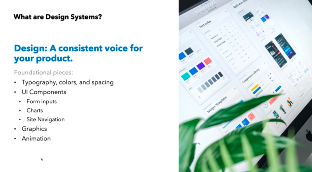
Design
“Design” turns into a consistent voice for your product. Those are things like typography, colors, and spacing, as well as UI components (forms, charts, site navigation), Graphics and Animation standards. These help standardize the visualization – the “look” – of the application. One can imagine an application developed by a large team that lacked a standard design – it would be disorienting to customers who expect consistency from software. A design system lets you take base pieces, document them well, and reuse them.
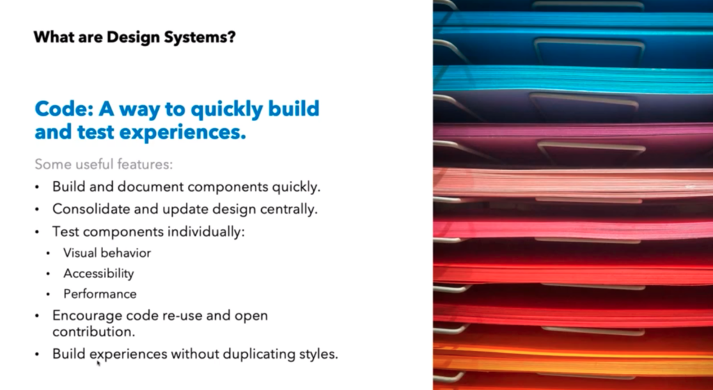
Code
“Code” lets you build and document components individually, test them once, and have a way to set expectations on whether or not this application will work. For instance, you can build a component in the app for one persona and reuse that component multiple times inside the app without worrying that you must retest it. Reuse makes code standard and creates standards for interacting with design. If you ever change design elements, the standard code reduces the effort to validate the new design with existing code.
Combining design and code into a design system results in increased developer productivity and a consistent voice for the application. And using a design system simplifies the management of an application.
Design Systems at Intuit: TurboTax Example
Next, Tyler dove into the use of design systems for the Intuit TurboTax product.
Tyler explained how TurboTax works. By providing users with interview-style questions, TurboTax helps millions of people, primarily in the United States and Canada, file their income tax returns. Intuit offers both web and mobile versions of TurboTax.
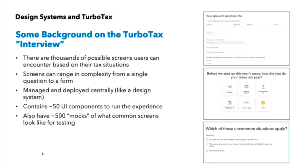
Because TurboTax uses interview questions to create conditional flows through the product, there are thousands of screens users can encounter based on their unique needs. Screens can range in complexity from a single question to a complete form.
Building the TurboTax Design System
To create the design, Intuit develops about 50 UI components needed to run the experience. Headers, radio buttons, tiles, multi-select, data entry, action buttons – all become part of the basic UI.
Intuit also builds a set of about 500 “mocks”, or mock-ups, of what common screens look like for testing. These help show the UI components in common layouts for testing purposes.
By using a design system, Intuit can make changes to the application and ensure consistency for all these screens.
Tyler gave the example of a decision to deliver a uniform increase in contrast in TurboTax for accessibility. The contrast changes required updates to typography weight, button color, and link color. This work would impact over 90% of all the screens. How could Intuit deliver these changes to the application and ensure they occurred consistently across the application? The team did not have the staff needed to manually check every possible screen. Instead, they made the design changes to the UI components and validated the mocks.
Testing A Design System
Next, Tyler dove into a discussion of testing a design system.
Approach
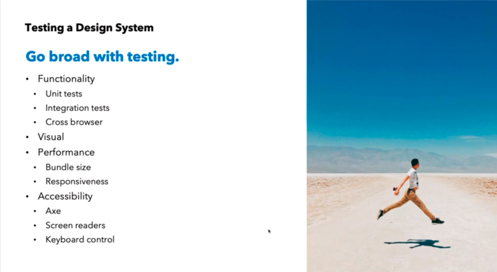
Since the design system represents all the functionality and visual representation of the application, Tyler recommends going broad with testing across all the elements, including:
- Functionality
- Visual
- Performance
- Accessibility
From a functional perspective, unit tests serve as key building blocks for code. Integration tests ensure that the code works wiht the back end. Cross-vrowser tests help ensure that the code works on a bunch of different browsers and mobile devices.
Visual testing validates the impact of UI component changes on the overall UI. If buttons change size or Intuit uses a new font size, does the page continue to render correctly? Do unexpected breaks happen on pages? Do space reductions make pages look too constrained?
Performance testing involves checking the impact of code changes on page loading times. Specifically, do new packages or package upgrades change the amount of data transferred between the server and the browser – slowing the user experience?
Finally, Tyler tests accessibility to make sure that any customer who wants to use the product can do so. Whether a user has a screen reader or navigates solely by keyboard, ensure that the user can get around.
Getting Organized
With testing goals articulated, Tyler introduced Storybook as the tool for creating documentation and initial testing. If you use projects like React, Vue and Angular that allow you to build user interfaces in small components, the Storybook project lets you build interactions for those components and document their behavior.
Effectively, you demonstrate a use case for your components and show how they all interact together on a page. Each use case is one story – hence Storybook is a collection of these stories.
Storybook allows for a range of tests, including accessibility tests. For instance, Tyler uses Storybook to test keyboard navigation and focus. He also tests for things like hover behaviors – where components appear while the cursor hovers over another element, which may be difficult to test with automation. Testing with Storybook lets the testing team run tests early across the range of design system dimensions.
Dog Fooding
To deliver successful products, Tyler’s team must support the construction and use of these UI components. So, they actually write code to try out the components – just to see how they work. Putting together checkboxes or radio buttons, or drop-down lists helps show how the code interacts with components and creates mocks for testing the design system.
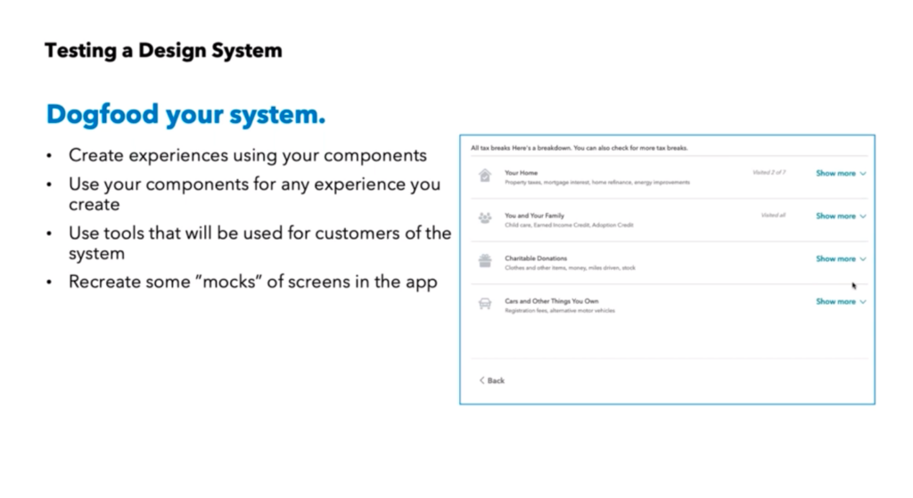
Tyler showed the example of a page that looked like static boxes. Each box expanded when clicked to show hidden detail and slid the rest of the page down. His team dog foods this kind of behavior.
All of these activities help create a body of testable code, so that a design change in the design system can be mocked up and validated without impacting production code.
Testing Walkthrough
Tyler then walked us through a simple change that can have a signficant implications – resizing a button.
Without a design system, you might have to make a button change like this ad-hoc across your application. As a result, you risk changing the page-to-page behavior and look-and-feel. Using a design system lets you make the change globally, and then focus on the implications.
What kinds of implications? A larger button might displace elements on a page. The button may not function as expected with existing elements on a given page. All these changes need to be tested.
Unit Tests
First, Tyler looked at unit tests. Does the button click? Can the button work with an icon associated with it? Will the button work with an transparent background? Does the button work with assigned ARIA (Accessible Rich Internet Applications) attributes? Testing puts these Storybook components through their paces.
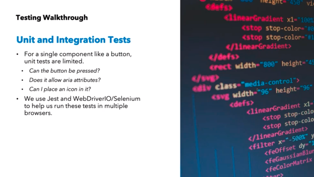
Intuit have a pretty standard way of running through these tests. Tyler talked about using JEST and WebdriverIO and Selenium to automate this testing across multiple browsers. They have lots of users on multiple web browsers, as well as Mac users with Safari an iOS, so they pay special attention to those target platforms.
Accessibility Tests
Next, Tyler talked about accessibility testing. His team uses AXE to perform static validation for ARIA standards on application pages, including contrast checking. Tyler explained how AXE helps perform contrast checking. For instance, if a button is one color, does the background let the button stand out? AXE can do the contrast checking by comparing the two colors. Or, will the text be readable against its background – or is it too small or too thin? Again – AXE can make these calculations.
Tyler also talked about HTML customizations. For example, you want to use a special radio button design that isn’t included in the existing HTML. You build this behavior as a custom implementation – and then you have to validate this behavior across the browsers your customers use. Tyler pointed out that companies make these decisions to help brand their websites for customers. And, these custom behaviors must be validated for functionality and accessible behavior across multiple platforms. At the same time, since you are replacing functionality built into HTML, keyboard navigation still needs to behave as expected. So, you need to test those behaviors.
At Intuit, the team tests these behaviors manually – and with tools designed to help. By using popular screenreaders like Jaws, Voiceover, and NVDA, Tyler’s team ensures that these screen readers don’t get thrown off by customizations. Also through manual testing, the team checks to ensure that keyboard navigation results in expected page responses – for example, they make sure that focus states behave as expected. And, they also ensure that the page behaves correctly when a customer has selected “reduced motion”.
Performance Tests
From a design perspective, the design system simplifies app delivery. By using standard libraries and building standard behaviors, the design system creates this great look-and-feel. At the same time, developers need to consider the impact on performance. For instance, a specific package might add great mobile behavior – at the cost of an additional 1-2 seconds of page load time. Users likely won’t value the behavior over slower page load time.
You can choose a great library that gives you great functionality – but at what cost? How does the size of your Javascript package impact your page downloads? Often, this problem creeps up on you. You use an early version of the library and everything works well. But, when you update your application, your library update suddenly doubles in size. This happens quite often. New versions of libraries include new features – which add to the library load times. And, you have to rethink the software you’re using.
Tyler talked about how Intuit handles these kinds of challenges. If Intuit uses code from an open source project, they might contribute back to the project to make a library with reduced size. Or, they might use a different open-source package.
Visual Testing
Each time a new component gets introduced or modified, Intuit runs tests through Applitools Ultrafast Grid. Intuit has been running Grid since its first beta tests. With Ultrafast Grid, Intuit can set checkpoints and take screenshots across a range of browsers and devices. They can set multiple screen sizes (from mobile to Full HD and higher). Their goal – ensure that responsive pages behave as expected, and understand the impact of design changes on existing pages. Ultrafast grid gives them the capability to easily compare changes across different versions of an application.
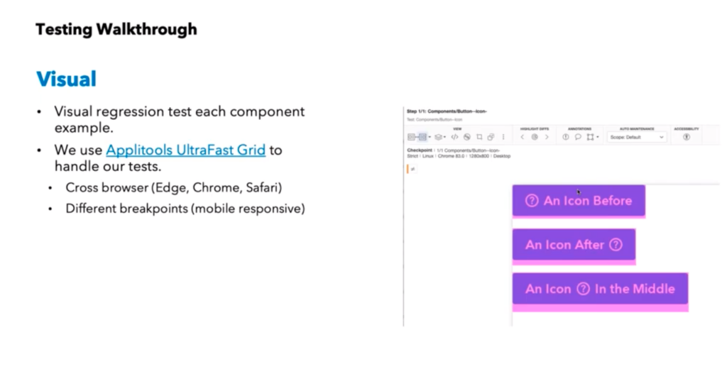
Tyler talked about using Ultrafast Grid to test against Chrome, Edge, and Safari. He talked about setting different viewport sizes to check responsive page behavior against expectations.
Component and Mock Level
Tyler explained how Intuit tests components and mocks.
In Storybook, Intuit keeps the latest components, as well as page mocks for each component in use. When a change occurs in the design system, Intuit can do two kinds of checks:
- They can check the components to see if the component changes have violated any specifications
- They check the mocks, to determine how the component changes affect page rendering.
So, for instance, Intuit can see if a collection of multiple new components violate spacing guidelines or other design requirements on pages. Applitools Ultrafast Grid helps Intuit do this evaluation.
Also using the mocks, Intuit can also see if a change violates accessibility guidelines using AXE.
Accessing Intuit Tools for Design Systems
Tyler discussed the two tools Intuit uses to ensure success in their design systems.
The first, the Intuit DS-CLI, makes it easy to implement Storybook for your designs. Just like Create-React-App lets you build a web app easily, DS-CLI contains all the code you need to utilize Storybook for component and mock management. This includes preconfigured Storybook, component templates with best practices, great Typescript support, and bundle size tracking. Tyler mentioned that DS-CLI is free and open source.
One great part about DS-CLI is size tracking. Each component can be tracked over time for package size. You can see when your bundles are growing – and why.
With the second, Intuit Proof, you can automate the development of test running in Storybook. Proof is a tapable testrunner for Storybook. Proof helps you automate tests for components and mocks by helping you know which ones have tests. In addition, Proof has built-in hooks for Applitools and Axe. So, instead of fumbling about inside Storybook to see what has been tested and what remains, you know what tests exist, which still need to be written, and helps you track their status.
Proof is also free and open source.
Conclusion
Tyler’s presentation made it clear that a design system can make your life much easier, but you need to invest in tools and methodology to help ensure consistency – the benefit of a design system.
You need a component evaluation system. You need mockups of your pages to test. And you need a testing environment. Intuit does all this inside Storybook.
Next, you need a testing strategy to get components evaluated and integrated into your pages. Invest in unit testing and test runners. Especially if you care about being perceived as open to all users – invest in accessibility tools. And, finally, know that rendering matters – invest in visual evaluation solutions like Applitools.
Finally, you need some pieces of infrastructure to make your design system work. Intuit shares theirs open source.
If you make these investments up front, a design system can serve your development and test strategy to help you easily develop incremental improvements across your application without fear of code changes.


